10 Ultimate Principles of Color Theory for Garden Design: Planting with Purpose
Ever walked into a garden and felt an immediate sense of calm, excitement, or wonder? Chances are, the masterful use of color played a significant role. Far from being a random assortment of blooms, a truly impactful garden is often a symphony of carefully chosen hues, orchestrated with the principles of color theory in mind. This comprehensive guide will unleash the power of color theory garden design planting, transforming your outdoor space into a vibrant tapestry that speaks to your soul and delights the eye.
[lwptoc]
Whether you’re a seasoned horticulturist or a budding enthusiast, understanding how colors interact can elevate your garden from merely pretty to truly breathtaking. We’ll delve into the science and art behind harmonious and dramatic planting combinations, equipping you with the knowledge to plant with purpose and create a garden that evokes precisely the emotions you desire.

Why This Matters for Your Garden
Beyond simply looking good, strategic color placement can dramatically influence the perception and utility of your garden space. Colors have a profound psychological impact, influencing mood, perceived temperature, and even the apparent size of an area. A thoughtful application of color theory in garden design allows you to craft specific atmospheres and guide the viewer’s eye through your landscape.
Imagine creating a serene, restful nook with cool blues and purples, or energizing a dull corner with bursts of fiery reds and oranges. You can make a small garden feel larger by using cool, receding colors at its edges, or bring distant elements closer with vibrant, warm hues. Understanding these dynamics is the key to creating a garden that isn’t just a collection of plants, but a living, breathing work of art tailored to your preferences and needs.
Moreover, considering color throughout the seasons ensures your garden remains captivating year-round. It allows for intentional shifts in mood and emphasis, transforming your outdoor space into an ever-evolving masterpiece. This isn’t just about aesthetics; it’s about creating a more engaging and functional environment.
What You Need for Mastering Color Theory Garden Design Planting
Embarking on your color theory journey doesn’t require a lot of specialized equipment, but a few key items and resources will prove invaluable.
- A Color Wheel: This is your fundamental tool. A garden-specific color wheel, or even a standard artist’s color wheel, will illustrate primary, secondary, and tertiary colors, as well as their relationships (complementary, analogous, triadic). Many garden centers or art supply stores carry them.
- Notebook and Pencils/Colored Pencils: Essential for sketching out ideas, noting plant characteristics, and planning your color schemes. Colored pencils allow you to visualize your concepts more accurately.
- Plant Catalogs and Online Resources: These will be your go-to for researching plants by color, bloom time, height, and growing conditions. Look for detailed descriptions and high-quality images.
- Your Garden Layout/Plan: Even a simple sketch of your garden’s existing layout helps you identify areas that need attention and visualize where new plantings will go.
- Patience and Observation: The best garden designers spent years observing nature and experimenting. Don’t be afraid to try new combinations and learn from what works (and what doesn’t).
- Open Mind: Sometimes the most unexpected color pairings yield the most stunning results. Be willing to step outside your comfort zone.
Step-by-Step Guide to Applying Color Theory in Your Garden
Let’s break down the process of intentionally integrating color theory into your garden design, moving from understanding the basics to crafting stunning visual narratives.
Step 1: Understand the Basics of the Color Wheel
The color wheel is the cornerstone of all color theory. It organizes colors by their spectral relationships.
- Primary Colors: Red, blue, and yellow. These are the foundation, from which all other colors are mixed.
- Secondary Colors: Orange (red + yellow), green (blue + yellow), and purple (red + blue).
- Tertiary Colors: Created by mixing a primary and a secondary color (e.g., red-orange, blue-green, yellow-green).
- Warm Colors: Reds, oranges, and yellows. These colors tend to advance, draw attention, and evoke feelings of energy, warmth, and excitement. They can make an area feel smaller and more intimate.
- Cool Colors: Blues, greens, and purples. These colors tend to recede, create a sense of calm, and evoke feelings of peace, tranquility, and spaciousness. They can make an area feel larger.
Get comfortable with these fundamental categories. Practice identifying warm and cool hues in plant images.
Step 2: Choose Your Dominant Mood and Scheme
Before selecting a single plant, decide what feeling you want your garden (or a specific section) to evoke. Do you want it to be a vibrant, energetic space for entertaining, or a tranquil retreat for meditation? Your desired mood will dictate your color scheme choice. Here are the most common color schemes for gardens:
- Monochromatic: Using different shades, tints, and tones of a single color. This creates a sophisticated, subtle, and harmonious effect. For example, a garden focused entirely on various shades of blue, from sky blue delphiniums to deep navy salvias.
- Analogous: Using colors that are next to each other on the color wheel (e.g., yellow, yellow-orange, orange). This creates a harmonious, visually pleasing, and calming effect, as the colors share a common hue.
- Complementary: Using colors directly opposite each other on the color wheel (e.g., red and green, blue and orange, yellow and purple). This creates high contrast and visual drama, making colors appear more vibrant. Use complementary colors for “pop” and focal points.
- Triadic: Using three colors evenly spaced around the color wheel (e.g., red, yellow, and blue). This offers strong visual contrast and richness while maintaining balance. It’s a bold and often festive scheme.
- Neutral Scheme: Relying heavily on whites, creams, silvers, and various shades of green. This creates a classic, elegant, and often understated look. Textures and forms become more prominent.
Sketch various options in your notebook, considering which scheme best aligns with your garden’s purpose.
Step 3: Select Your Plants Based on Color, Form, and Texture
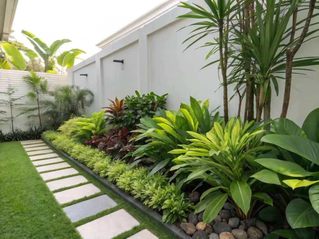
This is where your vision starts to materialize. مسلحًا with your chosen color scheme, begin researching plants. Don’t just look at flower color; consider foliage color (e.g., golden hostas, purple heucheras, variegated leaves) as it provides color even when plants aren’t blooming. Also, consider the form (tall, mounding, spreading) and texture (fine, coarse, glossy, matte) of plants, as these elements contribute significantly to the overall aesthetic.
When selecting plants, think about bloom times to ensure a continuous display of color throughout the seasons. Choose a mix of perennials, annuals, and shrubs to provide structure and ongoing interest. Research their light, soil, and water requirements to ensure they will thrive in your specific garden conditions. A healthy plant always looks better than a struggling one, regardless of its color.
Step 4: Consider the Impact of Light and Distance
The way light hits your garden profoundly affects how colors are perceived. Warm colors (reds, oranges, yellows) glow in strong sunlight, while cool colors (blues, purples) can appear washed out. Conversely, cool colors truly come alive in shade or twilight, appearing richer and more intense, making them excellent choices for evening gardens or shady spots. Warm colors might lose some of their vibrancy in dim light.
Distance also plays a crucial role. Warm, bright colors tend to advance visually, making them appear closer and creating a sense of intimacy. Use them in areas you want to draw immediate attention to. Cool, softer colors recede, making spaces feel larger and more expansive. Place these at the far end of a long border to create depth, or along the perimeter of a small garden to open it up. Experiment by holding plants (or pictures of plants) at different distances to observe their effect.
Step 5: Practice the Art of Repetition and Juxtaposition
To create a cohesive and visually appealing garden, implement repetition of colors, forms, or textures throughout your design. Repeating a specific color or a grouping of colors helps to unify the garden and guide the eye effortlessly. This doesn’t mean using the same plant everywhere, but rather echoing a color theme in different areas or with different plant varieties that share that hue.
Conversely, strategic juxtaposition, or placing contrasting elements together, creates drama and focal points. A splash of complementary color can make the surrounding hues pop. For instance, a vibrant orange perennial placed among a bed of deep blues will immediately draw the eye. Use these “punctuation marks” sparingly to maintain overall harmony while adding excitement. Think of the garden as a painting, where balance between unity and variety is key.
Pro Tips and Common Mistakes
Elevate your color theory game with these insights and avoid common design pitfalls.
Pro Tips:
- Borrow from Nature: Observe natural landscapes for inspiring color palettes. Think about how colors transition in a meadow or how forest undergrowth shifts.
- Start Small: Don’t try to redesign your entire garden at once. Focus on one bed or a specific area to experiment with color.
- Consider Foliage as Color: Many plants offer stunning leaf colors that provide year-round interest. Silver lamb’s ear, purple heucheras, red-tinged sedums, and golden euonymus are just a few examples. Foliage often provides the dominant color in a border.
- Think in Layers: Just like a painting, a garden has foreground, midground, and background. Use lighter, cooler colors in the background to create depth, and brighter, warmer colors in the foreground to draw attention.
- Factor in Bloom Time: Plan for continuous color. Don’t let your garden have “dead spots” where nothing is blooming in your chosen color scheme.
- Use White and Silver for Unity: White flowers and silver foliage are excellent as “separators” between strong colors or to add luminosity to shady spots. They harmonize virtually any scheme. Consider planting plants suitable for your climate zone.
Common Mistakes to Avoid:
- Too Many Different Colors: A garden with every color of the rainbow without careful selection can look chaotic and jumbled, rather than harmonious. Stick to a chosen color scheme.
- Ignoring Foliage: Overlooking the color contribution of leaves means you’re missing out on a huge portion of your garden’s palette, especially when flowers aren’t blooming.
- Not Considering Scale: A dramatic color scheme that works in a small courtyard might be lost in a sprawling estate, and vice versa. Adjust your intensity and repetition based on your garden’s size.
- Forgetting About Texture and Form: Relying solely on flower color can lead to a flat, uninteresting design. Varying plant forms and textures adds crucial visual interest.
- Underestimating the Power of Green: Green is often seen as a background, but it’s a vital component of any garden palette. Different shades of green (lime, emerald, sage, deep forest) add richness and depth.
- Planting in Isolation: Each plant should ideally relate to its neighbors in terms of color, form, or texture, contributing to an overall cohesive picture. Avoid having isolated “specimen” plants that don’t fit in.
Eco-Friendly Variations
Integrating color theory into your garden design can also be done with a strong ecological conscience. Sustainable gardening practices enhance both the beauty and biodiversity of your outdoor space.
Native Plants for Natural Palettes: Focus on using native plants that are adapted to your local climate and soil conditions. These plants often have naturally harmonious color palettes that blend seamlessly with the regional landscape. They also require less water, fertilizer, and pesticides, supporting local ecosystems and beneficial insects.
Pollinator-Friendly Color Choices: Many vibrant colors attract specific pollinators. Reds and oranges appeal to hummingbirds, while blues and purples attract bees. Designing with these colors can create a visual feast for you and a vital habitat for local wildlife. Planting in drifts of color rather than single specimens makes it easier for pollinators to spot them.
Water-Wise Color: Drought-tolerant plants come in an incredible array of colors. Explore vibrant succulents, dusty lavender, silvery artemisia, and vivid gaillardia. These plants allow you to create stunning, color-rich designs without excessive water consumption, especially crucial in arid regions. Consider a drought-tolerant garden with vibrant colors.
Organic Soil Enrichment: Healthy soil leads to healthy, vibrant plants with stronger colors. Focus on enriching your soil with compost and organic matter rather than synthetic fertilizers. This not only supports robust plant growth but also nurtures the vital microbial life beneath the surface, contributing to a more resilient ecosystem.
Reduce, Reuse, Recycle: When planning your color scheme, consider using recycled materials for garden features, such as painted reclaimed wood for raised beds or colorful upcycled containers. This adds character and reduces waste while allowing you to introduce splashes of color in an eco-conscious way.
Seasonal Considerations for Continuous Color
A truly magnificent garden is one that evolves with the seasons, offering dynamic color displays year-round. Thinking seasonally ensures your application of color theory produces lasting beauty.
Spring’s Awakening: Spring is often dominated by pastels and bright, cheerful colors. Think delicate pinks, pale blues, soft yellows, and crisp whites of bulbs like daffodils, tulips, and crocus. These early bursts of color symbolize renewal and energy after winter’s dormancy. Plan for a rapid succession of blooms to maintain interest as the season progresses.
Summer’s Zenith: Summer brings the most intense and varied color palette. This is when you can really play with bold complementary schemes (e.g., vibrant purples and yellows, fiery reds and greens), triadic schemes, and rich analogous blends. Heat-loving annuals often provide continuous color, while perennials like hostas, daylilies, and coneflowers add structure and texture. Consider how warm and cool colors can create specific moods in different areas of your garden during the bright summer sun.
Autumn’s Grand Finale: As temperatures cool, the garden shifts to a palette of earth tones: deep reds, russets, golds, oranges, and plums. Many trees and shrubs become the stars with breathtaking fall foliage. Incorporate plants like mums, asters, and ornamental grasses that provide late-season color and texture. These warm colors create a cozy, rich, and contemplative atmosphere, preparing the garden for winter’s rest.
Winter’s Subtle Hues: While often perceived as bleak, winter still offers opportunities for color. Focus on evergreen foliage (ranging from deep forest green to blue-green and chartreuse), colorful barks (red twig dogwood, contorted hazel), and berries (holly, pyracantha). Even the subtle browns and grays of dormant plants can contribute to a serene, minimalist beauty. Plan for structural elements and evergreens to provide a constant backdrop of color variation.
Expert Resources for Deeper Learning
To further refine your understanding and expand your gardening expertise, explore these esteemed resources:
- Royal Horticultural Society (RHS) – Colour in Your Garden: The RHS is a world leader in horticulture. Their resources on color theory provide in-depth articles, plant suggestions, and practical advice from seasoned experts. It’s a goldmine for anyone serious about garden design.
- Gardening Know How – Creating Garden Color Schemes: This popular gardening website offers accessible articles for all skill levels. Their guides on color schemes provide excellent starting points and practical examples for various garden situations.
- University of Minnesota Extension – Color Elements in Design: University extension programs are fantastic sources of research-backed horticultural information. The University of Minnesota’s guide explores the principles of color in landscape design with an academic yet practical approach, perfect for those seeking a deeper understanding.
Conclusion
Mastering color theory garden design planting is an ongoing journey of observation, experimentation, and joy. By understanding the basics of the color wheel, intentionally choosing harmonious or dramatic palettes, and considering the nuances of light and season, you can transform your garden into a truly purposeful and emotionally resonant space. It’s about more than just pretty flowers; it’s about crafting an experience, guiding the eye, and invoking specific moods. Embrace the art and science of color, and watch your garden flourish into a masterpiece that truly reflects your vision and nurtures your well-being.
Remember, your garden is your canvas. Don’t be afraid to experiment, to combine the unexpected, and to let your personal style shine through. The most beautiful gardens are often those that tell a story, and color is one of the most eloquent languages you can use to tell it.
FAQ: Your Color Theory Garden Design Questions Answered
Q1: What is the easiest color scheme for a beginner to use in their garden?
A1: For beginners, an analogous or monochromatic color scheme is often the easiest and most forgiving. Analogous schemes use colors next to each other on the color wheel (e.g., different shades of blue, purple, and pink), creating a gentle, harmonious transition. Monochromatic schemes use various shades and tints of a single color, resulting in a very sophisticated and unified look that is hard to get wrong. Both minimize harsh contrasts and are generally pleasing to the eye.
Q2: How can I make a small garden look larger using color?
A2: To make a small garden appear more spacious, emphasize cool, receding colors such as blues, purples, and soft greens, especially at the edges or in the background of your beds. These colors create an illusion of depth and distance. Additionally, avoiding too many bold, warm colors that tend to advance can prevent the space from feeling cramped. Using lighter shades and incorporating white or silver foliage can also help to brighten and open up a small area.
Q3: Should I only consider flower color, or is foliage important?
A3: Foliage color is incredibly important, often even more so than flower color! While flowers bloom for a limited time, foliage provides consistent color and texture throughout the growing season, and sometimes year-round with evergreens. Varying foliage colors (greens, silvers, purples, yellows, variegated) adds depth, interest, and can help to tie different parts of your color scheme together, even when plants aren’t in bloom. It acts as the backbone of your garden’s color palette.
Q4: How do I create drama or a focal point with color?
A4: To create drama or a strong focal point, use complementary colors – those directly opposite each other on the color wheel (e.g., orange and blue, yellow and purple, red and green). The high contrast makes each color intensely vibrant and draws the eye. Plant these complementary pairs at key points in your garden where you want to grab attention. You can also achieve drama through bold, rich single colors or by using striking variations in plant form and texture alongside your chosen colors.